Retouch a photograph from 1945.
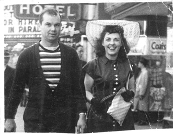
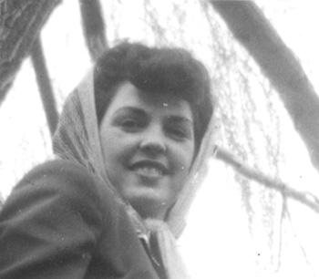
I was given this old print to scan and retouch, which I did via a Canon 8600F scanner using the 3rd party VueScan scanning software and Photoshop. The photo was not square (rectangular), thus the angled edges. The biggest challenge(s) were the wrinkles running through the image, which I fixed with the clone stamp. (Roll-over the image to see the edited version.) I also tweaked the levels a tiny bit.
Image editing: improve the look of this portrait photo.
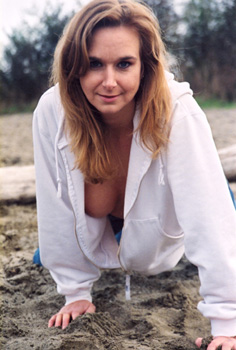
A scan of this film-based photo was made years ago, and though it was actually a fairly accurate scan (the picture was taken on an overcast day), the subject wanted me to make it look "better." The first thing I noticed was the cool color cast throughout the image, so I warmed it up without making it look unnatural. That plus some minor level adjustment was all that was needed. (Roll-over image to see the edited version.)
Image editing: digitally remove cast from model's arm.
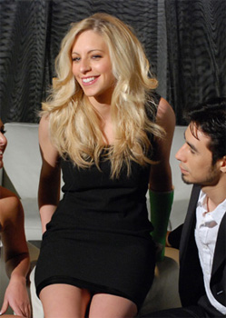
This is a detail portion of a photo taken at a shoot where one of the models (the blonde shown) had a cast (a bright-green colored one at that) put on her arm the day before the shoot. While it was great that she was still able to make the shoot, it meant she had to either hold her arm behind her in every shot (which looked very unnatural) or we had to deal with it in post. The producer wanted to use this shot, so I had to Photoshop out the cast on her arm in a way that looked natural. (Roll-over image to see the edited version.)
Graphic Design: Calendar
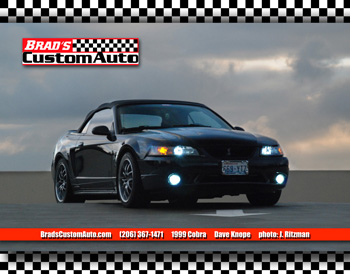
I was asked to design the official Calendar for Brad's Custom Auto for the third consecutive year (2010). The required elements were a photo (one for each month), the company's logo, web address, and phone number, a vehicle description, the name of its owner, and photo credits. Since the photos I was given to use were not all of the correct aspect ratio, and since the printing method to be used was not very precise in its own cropping, I decided to place the car images in a horizontal band across the page with a checkerboard-pattern background signifying the shop's specialty in performance vehicles.
The text info I placed in a logo-matching red stripe near the bottom, shadowed above the picture, using a strong typeface to, again, go along with the strong performance quality of the vehicles they work on. I then shadowed the logo above the picture, and then shadowed the picture above the background. The bottom drop-shadow came via Photoshop but the top shadow was custom made.
Image editing: clean-up photo for use in a calendar
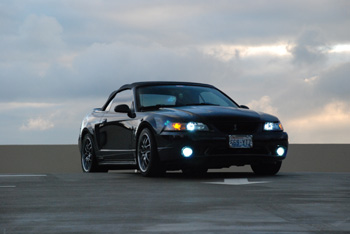
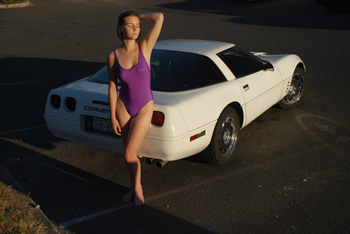
This photo needed to be cleaned up for use in a calendar, so I evened-out the pavement around the car and removed the parking lines, then darkened the sky (using an intentionally under-exposed version of the photo which was shot for this very purpose) and removed some lens flares. Roll-over the image to see the modified version.
Web design: create all new look for a preexisting site
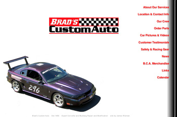
A performance auto shop had been using the same site design for a number of years and wanted an update. I redesigned each page from the ground up, with the key focus of making it cleaner looking and thus easier for visitors to find info. The previous design's home page had a good dozen or so logos of other companies which the shop did business with, so the first thing I did was to get rid of those and leave only the shop's own logo so that there would be no confusion over what site a viewer was at.
Second: in order to send a visual message about what the shop specializes in, I put a large image of the shop's premiere vehicle on the page. Third: for the site's navigation I went with a non-standard yet clearly visible percentage-positioned list of links. The shop also requested to have a "stripe" visual element, so I put a checkerboard stripe down the right side.
Web design: create new site
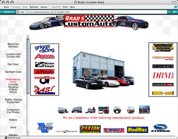
I was asked to design (and develop) a site for an auto shop from the ground up. They asked for quite a lot of elements to be on their home page, since they wanted visitors to know which aftermarket products they used. I used a top banner frame with their own logo and a couple images of vehicles they had built, using DHTML to move them out from behind the logo.
On the left is a navigation frame, wherein I again used some DHTML - this time to briefly change the color of the link text from black to red, simulating the firing order of a performance engine. In the main frame, a randomly selected (via JavaScript) image of the shop was shown, with links to additional images below it.
Image editing: fashion/portrait photo
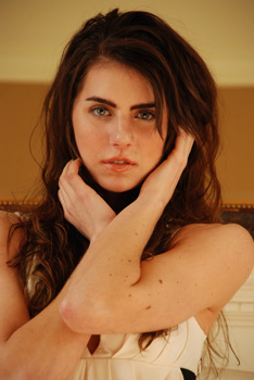
This portrait photo was taken during a fashion shoot and needed to be touched-up a bit: a level (gamma) change and I took out the birthmarks on her arm. Mouse-over the image to see the difference.
Graphic design: business card
A girl who does beadwork asked me to photograph some of her items and to make a business card for her. I used one of the photos I shot to create a visual description of what she makes, and the white space between the "loops" to encapsulate her contact info.
Image editing - photo touch-up
This photo was intended for a car calendar. I cleaned up the distracting elements on the ground around the car (debris and stains in the asphalt) and increased the contrast slightly to make the picture "pop" a little more.
Website design
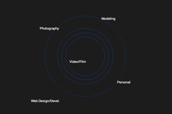
The site design I used for my personal for many years was based on my desire to have a site that wasn't your typical "boxes on top of and next to other boxes" website design. I wanted something organic and asymmetrical, so using Pro:FX Flash I laid out the links on the home page in a dispersed star pattern.
Graphic design: business card
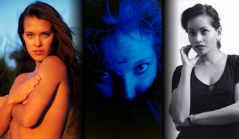
I wanted a business card for my photography services which showed examples of my work instead of just saying "James Ritzman, Photographer" so I selected images representing different styles: risque, artistic, and classic. My contact info was on the back.
Image editing - photo touch-up.
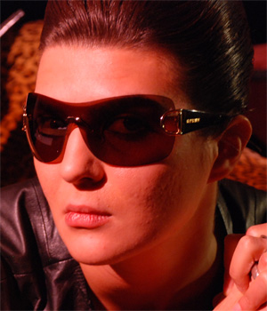
A shot I took of this model for the sunglass distributor was good, but not quite right. I adjusted the overall levels slightly, and lightened and smoothed out the skin of her cheek. Roll-over the image to see the difference.
Website design
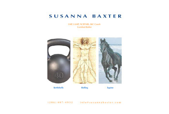
A girl I knew wanted a website featuring all the work she did: kettlebell lifting, rolfing, and equine rolfing. I designed and developed this site using Flash to give it a distinctive look. I found some images which I felt represented each aspect of her work to use as visual descriptions.
Image editing - photo retouching
This vintage photo needed some retouching, so after I scanned it I adjusted the lighting/exposure levels and cleaned up some of the spots and scratches. Roll-over the image to see the difference.
